Norde Supply Co. — When the site stops representing the brand
A direct-to-consumer outdoor gear brand in Amsterdam with a Webflow template stretched past what it was designed to do.
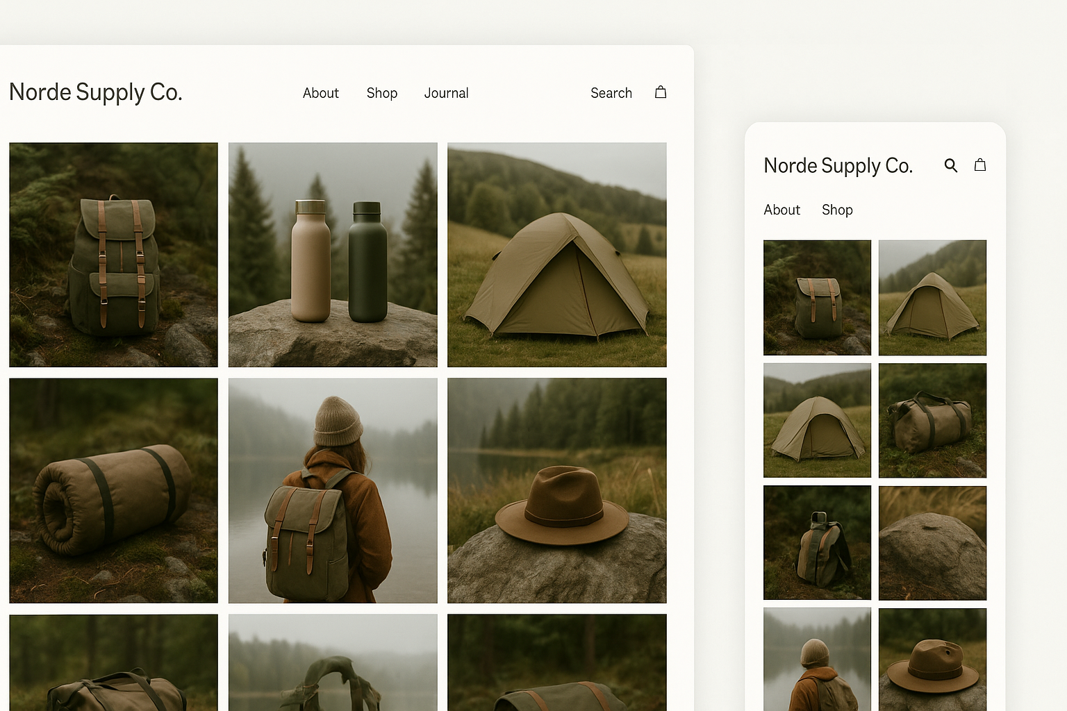
The situation
Norde Supply Co. started selling sustainable outdoor gear in 2021. By early 2024 their product range had grown from twelve SKUs to over eighty, and a website that was starting to work against them.
The original Webflow template had been a reasonable choice at the time. But templates are built around a product range of a certain size. When you add categories that didn’t exist, a collection of seasonal products, and a blog nobody had planned for, the navigation becomes a patchwork and the product hierarchy stops making sense to anyone not already familiar with the range.
The issue wasn’t visual. The site looked fine. The issue was structural: customers arriving from ads couldn’t easily orient themselves, couldn’t compare products across categories, and on mobile — which accounted for over 60% of their traffic — the navigation was nearly unusable.
What we started with
Before any design work, we did a UX audit going through the site as a first-time visitor across several scenarios: arriving from an Instagram ad, arriving from a Google search, arriving direct with no prior knowledge of the brand.
Three problems appeared consistently:
- The top navigation had nine items, several of which overlapped in meaning. A customer looking for “base layers” might reasonably check three sections before finding them.
- Product pages mixed gear categories with care instructions, sustainability information, and sizing guides in a single long scroll with no hierarchy.
- On mobile, the hamburger menu opened a full-screen overlay requiring multiple taps to reach any product category.
We wrote up the audit and walked through it with the Norde team before any design started — giving us a shared language for what to fix and why, rather than design decisions based on taste.
What we changed and why
We restructured the navigation around how customers actually shop outdoor gear: by activity (hiking, climbing, winter), not by product type (jackets, trousers, base layers). A customer who hikes knows they’re looking for hiking gear; they don’t necessarily know they want a “technical mid-layer.”
Product pages were redesigned with a clear hierarchy: product name and key specification at the top, then size and colour selection, then the buy action, then supporting information in an accordion below.
The mobile navigation was rebuilt as a slide-in drawer preserving the top-level category structure with one tap to subcategories. We tested this against the original with a small group of Norde’s existing customers before finalising.
The test wasn’t about preference. We asked people to find a specific product in each version and timed them. The new navigation was faster across all participants. That was the deciding factor.
The build
We rebuilt in Webflow, migrating existing product content into a CMS structure their team could manage without us. Category pages, product pages, and their journal — all editable from the Webflow CMS editor without touching code.
We also set up their collections to handle seasonal product logic they’d been managing manually: products can be flagged as seasonal and display a callout automatically, without needing to edit each product page individually.
Handover included a one-hour walkthrough of the Webflow editor and a written guide covering the tasks they’d need most: adding products, writing journal posts, updating category images.
What we’d do differently
The filtering on collection pages was built with Webflow’s native filtering, which has limitations around how many active filters can be combined. If starting again, we’d push for a custom filter solution from the start given the size of the product range.
We’d also budget more time for mobile navigation testing. One round was enough to make a better decision; a second round would have given us more confidence.
Have a similar problem?
If your site has grown past what it was originally built to do, we’re good at untangling that.
Get in touch